Responsive web design services sound like one of those phrases agencies throw around when they want to charge more. And sometimes that is exactly what’s happening.
But the real idea is simple.
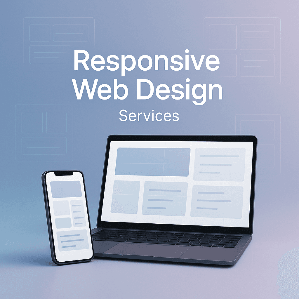
Your website should look good and work properly on a phone, a tablet, a laptop, a huge monitor, and the weird in between sizes too. It should not be a tiny desktop site squeezed onto a phone screen. It should not be a mobile site that looks fine until you rotate the phone and everything collapses. It should not make people pinch and zoom like it’s 2012.
And yes, this matters for aesthetics, but it’s mostly about money and trust. A site that feels broken on mobile quietly kills conversions. People don’t complain. They just leave.
So this post is about what responsive web design services actually include, what you should expect, what you should ask for, and how to tell if you’re paying for real work or just a theme install.
What “responsive” actually means (in normal language)
A responsive website adapts.
That means the layout, typography, spacing, navigation, images, and sometimes even the content hierarchy changes depending on screen size and device capabilities.
Not just “it fits.”
More like:
- The menu becomes usable with a thumb.
- The hero section doesn’t take up the whole screen on mobile.
- Buttons are big enough to tap.
- Text is readable without zooming.
- Images don’t load at 4000px wide on a phone.
- The important stuff shows up first, not buried under giant padding and sliders.
A good responsive site feels like it was designed for the device you’re using. Even though it’s the same site.
Why responsive web design services still matter in 2026
Most people assume responsive is automatic now. Like, you pick a modern WordPress theme, done.
Sometimes, sure. But the reality is messy:
- Templates are “responsive” in a technical sense, but awkward in real use.
- Builders can create responsive layouts, but they also let people accidentally create disasters.
- E commerce sites get complicated fast. Filters, product grids, variant selectors, carts, sticky add to cart buttons. All of that needs real thought.
- Many older sites are “kinda responsive” but still painful. Tiny fonts, broken sections, overlapping elements, massive load times on mobile.
Also, Google has been mobile first indexing for a long time. That alone is enough reason to take this seriously. But beyond SEO, user expectations are just higher now. If your site feels clunky on a phone, you look outdated. Even if your business is great.
What you actually get with responsive web design services
This is where things vary a lot, depending on the provider. But if you’re hiring someone for responsive web design services, here’s what should be included in some form.
1. Responsive layout planning (not just resizing)
This is the part most people skip. The designer should think through breakpoints and layout shifts, not just hope the grid collapses nicely.
Expect decisions like:
- When does a 3 column section become 2 columns, then 1?
- Does the sidebar move below content or disappear?
- How should tables behave on mobile?
- Does the navigation become a hamburger menu, a bottom nav, or a sticky header?
- Do we change spacing and font scale for readability?
If the plan is “it’ll stack,” that’s not a plan. Sometimes stacking is right, but someone should be deciding it intentionally.
2. Mobile first design thinking
A lot of good responsive work starts on mobile. Not because desktop doesn’t matter, but because mobile forces priorities.
When you design mobile first, you naturally ask:
What is the main job of this page?
Is it to book a call. Buy a product. Get a quote. Read an article. Find a location. Whatever it is, mobile design makes you put that front and center.
Then you scale up to desktop and add enhancements.
When you do it backwards, you often end up trying to cram a giant desktop layout into a phone. That’s when things feel cramped and chaotic.
3. Responsive typography and spacing
This is the unsexy part that makes a site feel expensive.
Good responsive design adjusts:
- Font sizes
- Line height
- Max line length
- Padding and margins
- Section spacing
- Button sizes
On desktop, you can afford breathing room. On mobile, too much spacing turns your page into endless scrolling. Not enough spacing makes it feel cramped. There’s a balance.
Also, headings that look bold and strong on desktop can look ridiculous on mobile if they wrap into three lines. A responsive designer accounts for that.
4. Performance work (especially on mobile)
If someone says they do responsive web design services but they never mention performance, that’s a red flag.
Because responsiveness isn’t only layout. It’s also how the site behaves on real mobile connections and real mobile devices.
This can include:
- Proper image sizing and modern formats (like WebP or AVIF)
- Lazy loading where appropriate
- Reducing heavy scripts and third party trackers
- Font loading improvements
- Caching and compression basics
- Avoiding massive animations that tank mobile performance
A slow mobile site is basically a non responsive site in disguise. It technically fits, but nobody wants to use it.
5. Touch friendly UX
Desktop users click with a mouse. Mobile users tap with thumbs. That changes everything.
Responsive web design services should cover:
- Tap target sizes (buttons and links that are easy to hit)
- Spacing between links (so users don’t tap the wrong one)
- Sticky elements that don’t cover content
- Form fields that are easy to use on mobile keyboards
- Click to call buttons for phone numbers when it makes sense
I’ve seen so many “responsive” sites where the menu links are so close together you basically need surgeon fingers. That’s not a win.
6. Cross device testing and bug fixing
A big part of the work is just… testing. And fixing the weird stuff.
Testing should include:
- iPhone Safari
- Android Chrome
- Desktop Chrome, Safari, Firefox, Edge
- Different screen sizes, not just one phone and one laptop
- Basic accessibility checks (contrast, focus states, keyboard nav)
This is where cheap work shows. Because issues always show up. And if the provider doesn’t budget time for this, you end up with broken sections no one noticed until customers complain.
Common types of responsive web design projects
Responsive web design services can mean a few different things. It helps to know what category you’re in.
Option A: New responsive website (from scratch)
Best if:
- Your current site is old, messy, slow, or hard to update
- Your brand has changed
- You need a better structure and conversion focused pages
This typically includes design, development, content migration, and testing.
Option B: Responsive redesign (keep the content, rebuild the layout)
Best if:
- Your copy is fine, but the experience is outdated
- Your site is technically functional but visually tired
- You need better mobile conversions
This can be faster than a full rebuild, but still requires real design thinking.
Option C: “Make my site responsive” fixes
This is common for older sites that were built before responsive design was standard, or sites that got hacked together with custom CSS.
A good provider will audit pages and templates, identify breakpoints, then refactor layout and styles.
Sometimes it’s quick. Sometimes it’s a nightmare. It depends on how the site was built.
Option D: Landing page and funnel optimization for mobile
This is underrated. Many businesses run paid traffic to pages that look fine on desktop and fall apart on mobile.
Mobile landing page work usually includes:
- Shorter sections
- Clearer CTAs
- Sticky CTA buttons
- Simplified forms
- Faster load times
What responsive web design services should include for SEO (without overpromising)
Responsive design helps SEO indirectly because it improves usability. But it also has direct technical implications.
A solid responsive service provider will consider:
- Core Web Vitals (LCP, INP, CLS)
- Proper heading structure and readable typography
- Mobile usability issues (Google Search Console flags these)
- Avoiding intrusive interstitials and popups on mobile
- Making sure content is not hidden or truncated in a way that hurts indexing
One thing though. Responsive design will not magically rank you. If someone sells it like that, take a step back. It’s part of the foundation.
Pricing: what it usually costs (and why it varies so much)
Responsive web design pricing is all over the place because “website” can mean a 5 page brochure site or a full custom platform.
But here’s a rough, honest range you’ll see:
- Basic responsive refresh for a small site: $800 to $3,000
- Custom responsive small business site: $3,000 to $10,000
- Custom design plus development, strategy, content help: $10,000 to $30,000+
- E commerce responsive build (Shopify, WooCommerce, custom): $8,000 to $50,000+ depending on complexity
The real drivers of cost are:
- How many unique page templates
- Custom design vs template customization
- Animations and interactions
- CMS complexity
- Integrations (CRM, booking, payments, inventory)
- Content migration volume
- Performance and accessibility requirements
- How many rounds of revisions
If someone quotes you $300 for “responsive web design services,” you’re likely getting a theme, a page builder, and a prayer.
What to ask before hiring a responsive web design provider
If you want to avoid headaches, ask these questions up front. The answers tell you a lot.
- Do you design mobile first or desktop first, and why?
- What breakpoints do you design for? (Not just “mobile tablet desktop.” That’s vague.)
- How do you test on real devices?
- Will you optimize images and performance, or is that separate?
- What’s your process for handling revisions?
- Will I be able to edit content easily after launch?
- How do you handle accessibility basics?
- Can you show me examples of responsive work, and can I view them on my phone right now?
- What happens after launch if something breaks on mobile?
Also, one practical thing. Ask if they’ll build with a staging environment and show you previews on different device sizes. If the workflow is “we’ll launch and then see,” that’s stressful.
Red flags (stuff that sounds fine until it isn’t)
- They only show desktop mockups.
- They rely on “it’s a responsive theme” as the entire strategy.
- They don’t mention testing.
- They use huge hero videos everywhere without talking about mobile data or performance.
- They build everything inside a page builder with no plan for consistency. Every page becomes its own snowflake.
- They promise the site will look “exactly the same” on every device. It shouldn’t. It should adapt.
What a good responsive website feels like
This is subjective, but you know it when you use it.
A good responsive site feels:
- calm, not cramped
- fast, not heavy
- clear, not clever
- easy to tap, easy to read
- consistent across pages
- like the business behind it has their act together
And that’s kind of the point. Responsive design is not just technical compliance. It’s a trust signal.
If you’re ready to improve your site, start with this
If you’re considering responsive web design services, don’t start by arguing about pixels.
Start by looking at your site on your phone like a customer would. Do it on cellular data, not WiFi. Try to complete the main action you want visitors to take.
- Can you find what you need in 10 seconds?
- Can you tap the button without zooming?
- Does anything jump around as the page loads?
- Do images load fast?
- Do forms feel annoying?
If the experience is even slightly frustrating, it’s costing you more than you think.
Responsive web design is one of those upgrades that doesn’t always feel exciting while you’re paying for it. Then it goes live and suddenly people stay longer, bounce less, and actually finish the checkout or send the inquiry. Quiet wins.
That’s the good stuff.
FAQs:
1. What does responsive web design really mean?
Responsive web design means your website adapts its layout, typography, spacing, navigation, images, and sometimes even content hierarchy depending on the screen size and device capabilities. It ensures the site looks good and works properly on phones, tablets, laptops, large monitors, and all sizes in between—not just shrinking a desktop site onto a phone screen.
2. Why do responsive web design services still matter in 2026?
Despite the assumption that responsive design is automatic with modern themes, many templates are only technically responsive but awkward in real use. Complex sites like e-commerce need thoughtful responsive solutions. Plus, Google uses mobile-first indexing, and user expectations for seamless mobile experiences are higher than ever. A clunky mobile site can hurt your SEO, conversions, and brand trust.
3. What should I expect from professional responsive web design services?
Professional services should include responsive layout planning with intentional breakpoints and layout shifts; mobile-first design thinking prioritizing key actions on small screens; responsive typography and spacing for readability without excessive scrolling; performance optimization especially for mobile devices; and touch-friendly UX with appropriately sized tap targets and easy-to-use form fields.
4. What is involved in responsive layout planning?
Responsive layout planning goes beyond simply resizing elements. Designers decide when multi-column sections become fewer columns or stack vertically, how sidebars behave on smaller screens, navigation style changes (like hamburger menus), table behaviors on mobile, as well as adjustments to spacing and font scaling to maintain usability across devices.
5. How does mobile-first design thinking improve responsive websites?
Mobile-first design starts by focusing on the primary goals of each page on small screens—such as booking a call or buying a product—putting those front and center. Then enhancements are added for larger screens. This approach avoids cramming desktop layouts into tiny screens, resulting in cleaner, more user-friendly experiences on mobile devices.
6. Why is performance important in responsive web design?
Performance directly impacts user experience on mobile devices. Responsive web design includes optimizing image sizes and formats (like WebP or AVIF), lazy loading content where appropriate, minimizing heavy scripts and trackers, improving font loading times, leveraging caching and compression, and avoiding resource-heavy animations. A slow site frustrates users and kills conversions even if it visually fits the screen.